
Label Face Stock Guide — The Label Materials We Actually Run
Not a catalog page. These are the face stocks that come off our presses every week in Dongguan, what each one costs, when it works, and when it doesn’t. If you’re choosing a label material today, this is the short version of what our prepress team would tell you at the desk.
Every week someone sends us artwork and asks “what material should I use?” Half the time they’ve already picked the wrong one based on a Google search that was written by someone who’s never loaded a die. Below are the core stocks we keep in inventory year-round, with real photos from jobs we’ve actually printed.
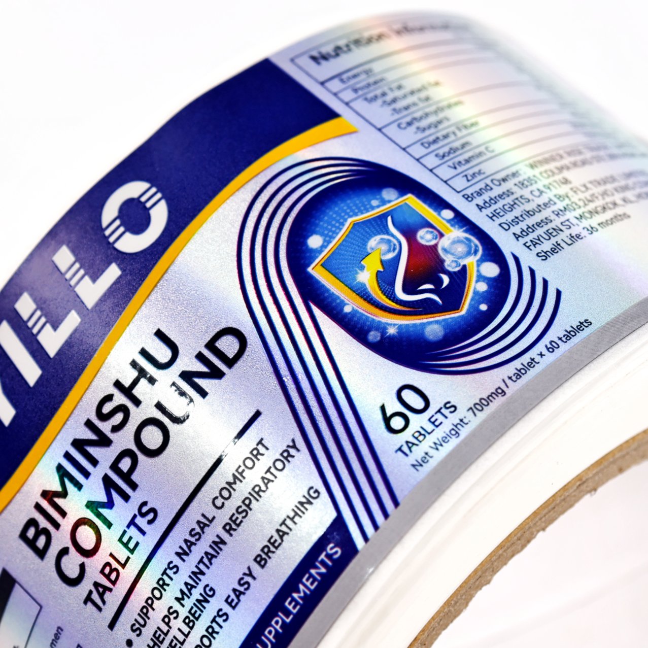
Holographic / Rainbow Film
Holographic BOPP — When You Want the Label to Catch Light
This is BOPP film with an embossed micro-pattern that splits light into rainbow colors. It’s not printed holography — the effect comes from the material itself. You print on top of it (or leave areas clear) and the background shimmers as the bottle moves.
- Thickness: 40–50 micron, same base as standard BOPP
- Best for: Supplements, vitamins, cosmetics, anything on a retail shelf where shelf-pop matters more than minimalism
- Prints well with: Foil stamping (silver/gold pops against the rainbow), spot UV, and dark solid colors
- Avoid if: You want a clean matte look — this material is loud by design
- Real job: The photo above is a supplement bottle label we ran last month. The client wanted something that looked different from every other white bottle on the shelf. Holographic did that without any special finishing.
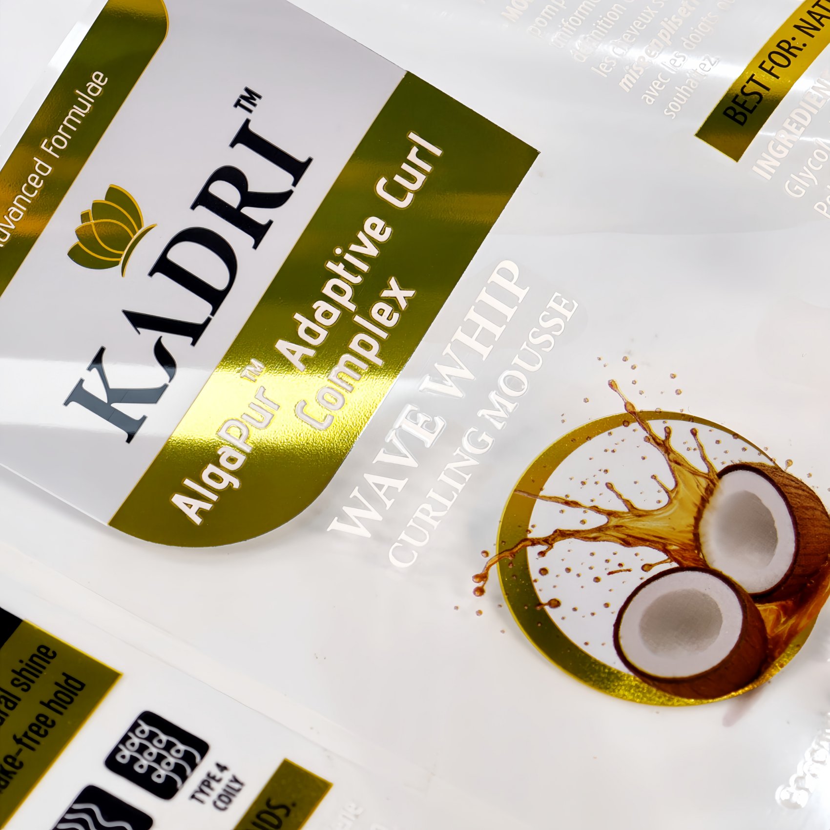
Clear PET (Polyester)
Clear PET — The “Invisible” Option
PET (polyester) is thinner and tougher than BOPP. Clear PET is what you use when you want the label to disappear and let the product show through. Think premium spirits in clear glass, or containers where the liquid or cream inside is part of the design.
- Thickness: 25–36 micron — noticeably thinner than BOPP, which means it conforms tighter to curved surfaces
- Best for: Clear glass bottles, cosmetic jars where you want to show the product color, any “no-label” look
- Key advantage over clear BOPP: PET is harder to scratch and handles higher heat (good if your filling process involves warm bottles)
- Print consideration: White ink is mandatory under light colors — otherwise the container color bleeds through and shifts your design
- Real job: The mousse container above uses clear PET so the gold foil branding floats directly on the product. No white border, no visible edge.
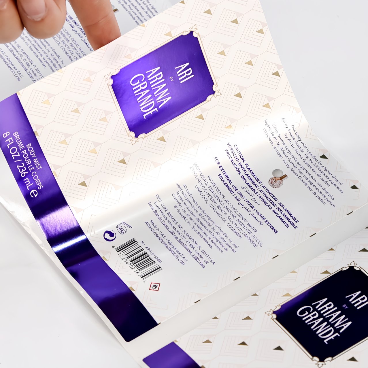
Silver Metallic BOPP
Silver Metallic BOPP — Mirror Finish Without Foil Cost
This is BOPP film with a vacuum-metalized silver layer. It gives you a mirror-like reflective surface across the entire label area — no need to selectively foil-stamp specific parts. You can print full color on top, and the silver shines through the unprinted areas.
- Thickness: 40–50 micron (standard BOPP range)
- Best for: Personal care, cosmetics, beverage — anything where “premium” needs to read from three feet away
- Cost vs. foil: Cheaper than hot foil stamping because the metallic effect is built into the stock, not an added process step
- Design tip: Works best when you use the silver as a design element — leave areas unprinted so the metal shows, or print white + one accent color for a two-tone metallic look
- Real job: The body mist bottle above runs on silver BOPP. The purple panel and text are printed on top; the exposed silver areas give it a luxury feel without a separate foil die.
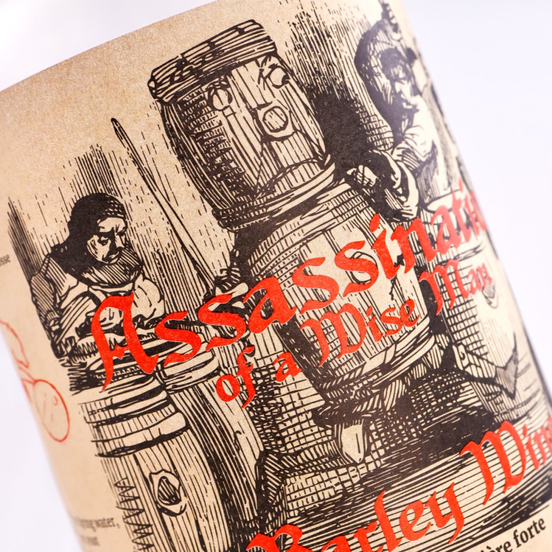
Kraft / Textured Paper
Kraft Paper — When “Craft” Is the Whole Point
Kraft is unbleached wood pulp paper with a visible fiber texture and a natural brown tone. It’s the material you pick when the brand story is artisanal, organic, handmade, or heritage. Nothing says “small batch” like kraft.
- Basis weight: 80–120 gsm (thicker than coated paper, feels substantial)
- Best for: Craft beverages (craft beer, small-batch spirits), candles, organic food, artisanal cosmetics, anything with a “made by humans” narrative
- Prints beautifully with: Letterpress-style designs, embossing/debossing (the texture holds the impression), and limited color palettes (1–2 colors look better than CMYK on kraft)
- The trade-off: Not water-resistant. Don’t put it on refrigerated or wet-touch products unless you add a heavy laminate (which kills some of the craft feel)
- Real job: The wine label above is kraft paper with a vintage woodcut illustration. The brown background + black linework + red accent reads “limited edition” before the customer even reads the text.
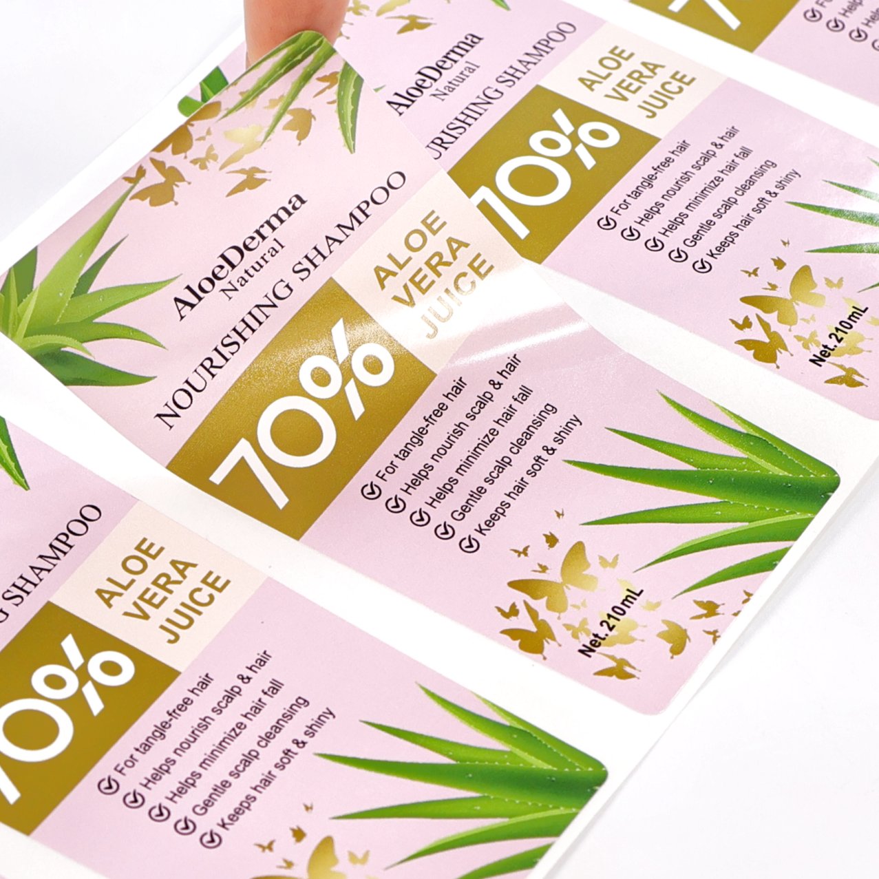
White PP Synthetic Paper
White PP Synthetic — Looks Like Paper, Acts Like a Film
PP synthetic paper is polypropylene extruded into a sheet that looks and prints like paper but behaves like a film. It’s opaque white, tear-proof, water-resistant, and takes ink cleanly. This is the “I can’t decide between paper and film” answer.
- Thickness: 60–80 micron (feels like 100+ gsm paper but much stronger)
- Best for: Personal care (shampoo, lotion, soap — things that live in wet bathrooms), outdoor tags, reusable containers, anywhere paper would fail but you don’t want a glossy film look
- Key advantage: Tear-proof. You literally cannot rip it with your hands. Great for products that get rough handling
- Finish options: Comes in matte (default, looks like paper) or gloss. Matte is the popular choice — it gives a clean modern feel without the synthetic shine
- Real job: The shampoo labels above run on white PP synthetic with gold hot foil accents. They survive daily bathroom humidity without curling or bleeding, and the matte surface keeps the design looking sharp.
Quick Comparison
| Holographic BOPP | Clear PET | Silver BOPP | Kraft Paper | White PP | |
|---|---|---|---|---|---|
| Looks like | Rainbow shimmer | Invisible/clear | Mirror silver | Natural brown | Clean white |
| Water resistant | Yes | Yes | Yes | No* | Yes |
| Tear resistant | Good | Excellent | Good | No | Excellent |
| Best shelf signal | Eye-catching | Premium/minimal | Luxury | Artisanal | Clean/modern |
| Typical µm | 40–50 | 25–36 | 40–50 | 80–120gsm | 60–80 |
*Kraft can be laminated for water resistance but loses some texture.
— prepress log, Q3 2025
What’s Next — Adhesive
Picking the face stock gets you halfway there. The other half is the glue backing it — and that’s where most label failures actually happen. Freezer-grade, removable, food-contact, repositionable… each use case needs a different adhesive family. That’s Part 2, coming next.
Not sure which material fits your product?
Email [email protected] with a photo of your container and we’ll tell you which of these (or something else entirely) we’d spec for your job — usually within one working day.
Pingback: FSC, rPET & Compostable Labels Guide | DJB Print