
You approve one brand blue. The cartons arrive. The labels arrive. The two blues are not the same blue. Nothing was printed “wrong” — the carton and the label were built on two different substrates, two different printing processes and two different standards. Because we run labels and coordinate cartons for the same brands, we watch this happen constantly. Here is where the delta comes from, and how to kill it before production.
Color Management
Substrate Compensation
Pantone + L*a*b*
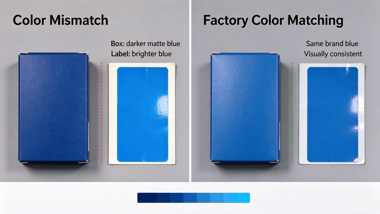
1. Where the Delta Comes From: Five Real Causes
1. Two printing processes, two color gamuts
Cartons are usually printed offset (CMYK) — stable, high resolution, wide gamut. Labels often run flexo or digital: flexo dot gain is more visible, and digital toner builds color on different logic from offset ink. Run the same blue through both and it is never quite the same blue.
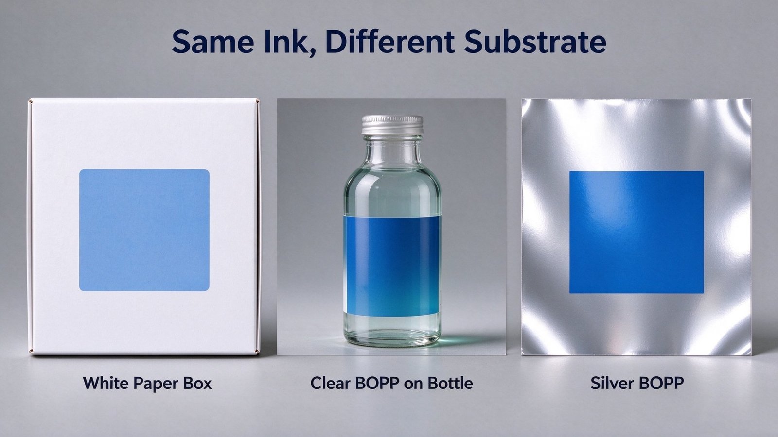
2. A different substrate, and every ink layer shifts with it
A carton prints on white paperboard; a label may sit on clear BOPP (letting the bottle color through), silver BOPP (a metallic base) or white film. Change the base color and brightness and everything laid on top changes with it. A clear or silver label can never be “the same” as a white paperboard carton — the base is different to begin with.
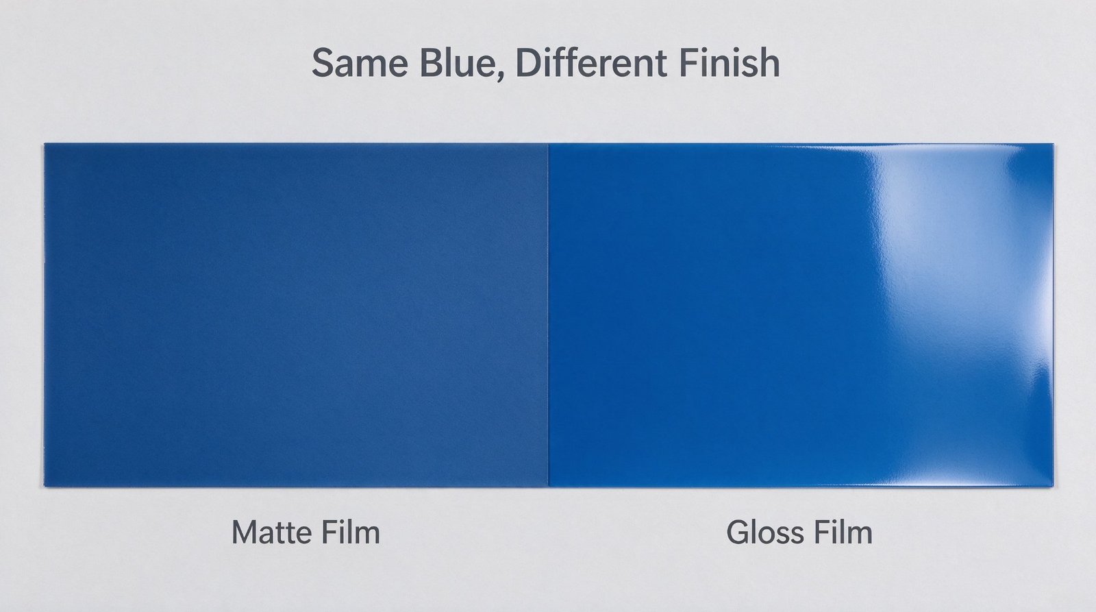
3. A different finish, a different brightness and saturation
Cartons are often matte-laminated, gloss-laminated or spot-UV’d; labels may be matte, unlaminated or varnished. Matte lamination darkens and desaturates; gloss lifts brightness. One blue, matte on the label and gloss on the box, reads as two different blues.
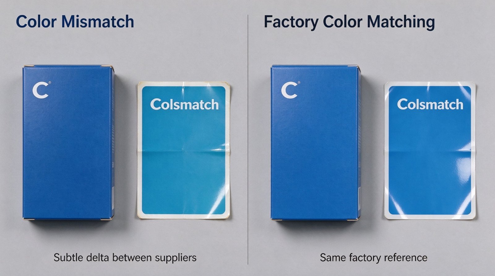
4. No single approved standard, so everyone prints their own
The brand hands over one Pantone. The carton printer and the label printer each interpret it their own way, and neither treats the other as the reference. With no single approved physical master, drift is not bad luck — it is the default outcome.
5. Metamerism, plus split production batches
Offset ink on the carton and flexo ink on the label have different chemistry, which produces metamerism: the two look identical under the store’s fluorescent light and fall apart in daylight. Add the fact that the box and the label are run in separate batches from different ink lots, and the gap widens further.
The short version: a carton and a label are two different products, made two different ways. The only thing that holds them together is one shared standard. Remove that standard and a mismatch is not an accident — it is the predictable result.
2. Carton vs Label: What Actually Differs
| Factor | Carton | Label | Effect on color |
|---|---|---|---|
| Printing process | Offset CMYK | Flexo / digital | Different gamut and dot structure |
| Substrate | White paperboard | Clear / silver / white film | Different base color |
| Surface finish | Matte / gloss / spot UV | Matte / none / varnish | Different brightness and saturation |
| Color standard | Its own Pantone | Its own Pantone | No shared reference |
| Production batch | Split runs | Split runs | Ink-lot drift |
3. How We Remove the Delta — An Honest Label House’s View
One standard, two components
The brand color is defined once — one Pantone, plus an L*a*b* tolerance. Both the carton and the label are made against it, instead of each running its own version of the same blue.
Shared color management
Same ICC profile, same spot color, one master proof. Both sides measure with a spectrophotometer and compare numbers — not vibes, not eyeballing under whatever light happens to be on.
Substrate-aware compensation
If the carton is white paperboard and the label is clear or silver film, we either print a white base layer to pull the label closer, or adjust the label ink to compensate for the film base — and we tell you which route we are taking up front, not after the goods land.
Aligned finishes
Keep the film or varnish on carton and label as close as possible, so you do not create a guaranteed offset such as a matte label sitting against a gloss carton.
Side-by-side proofing under one light source
Carton and label are always proofed together, side by side, under the same D65 light — never signed off separately, days apart, in different rooms.
Color control on small runs too
Small MOQ or not, the color workflow stays the same. That is exactly where we differ from a pure packaging house.
4. Five Questions to Ask Before the Goods Ship
- Does the brand color have one approved physical master?
- Are the carton and the label being made against the same Pantone and L*a*b* tolerance?
- Does the label substrate (clear / silver / white) match the carton base — and if not, has compensation been applied?
- Are the carton and label finishes aligned?
- Were the proofs reviewed side by side, under the same light source?
Worth saying plainly: a color mismatch is nearly free to fix before production and expensive to fix after. Once the cartons and labels are printed and shipped, your options are reprint, relabel or live with it. Lock one standard and sign the proofs together, early.
5. Common Questions
Can a clear label ever match a white paperboard carton?
Not naturally. Unless you print a white base layer to pull it closer, or compensate through the ink — both of which we confirm with you up front, so you do not discover the problem on the pallet.
Why does it match in the store but not at home?
That is metamerism — the carton and the label use inks of different chemistry. One shared standard plus side-by-side proofing cuts it down sharply, but true consistency across different light sources needs an agreed tolerance up front.
Do you control color on small batches too?
Yes. The color workflow is identical at 1,000 pieces and at 100,000, and that is part of what lets us take on small runs.
Related Reading
- Custom Metallic Perfume Labels — silver BOPP, gold metallic ink and matte lamination, matched to the bottle.
- Custom Shampoo & Personal Care Labels — the label line this article pairs with.
- Hot Foil Stamping Labels — the core metallic finishing technique.
- Clear PET Labels for Personal Care — the no-label look for bottles.
- When Bottle Chemicals Ate the Foil — a real label failure case study.